Heritage / 4 min read
A short history of the swirl
Forty years, three logos and one very loyal shade of green.
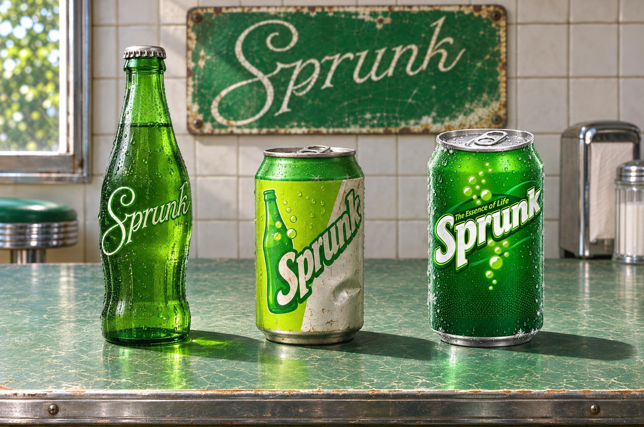
In 1986 Sprunk launched in Vice City with a hand-drawn script on a green bottle. It looked like every other soda of its time, which was the point: we wanted to look trustworthy, and we were very new at it.
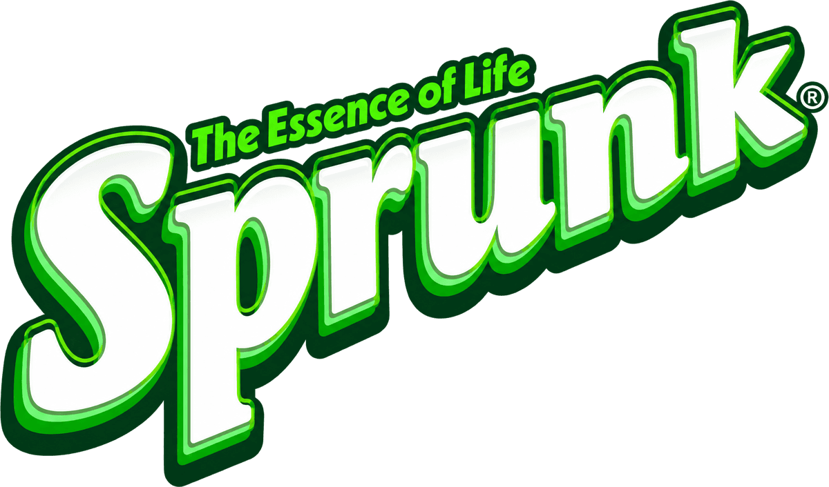
By 2011 the script had grown up into the logo you know: chunky white letters leaning into the wind, a stack of green outlines, rising bubbles and a dark swirl wrapped around the whole thing like a garden hose. It was loud. It was right.
2026
This year we cleaned it up. Same letters, same lean, same bubbles, same swirl. The outlines are sharper, the gradients are gone and the bubbles finally look like bubbles. If you didn't notice, we did our job.
Change the logo every fifteen years. Change the recipe never.
Sprunk Stories is published by The Sprunk Company, Tudor, Alderney. Everything here is true in the sense that we wrote it down.